Auteur: Greg Suffanti
Inleiding
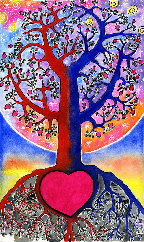
Greg Suffanti is al kort na de oprichting van de Quest for Wisdom Foundation betrokken geraakt bij de stichting; eerst als schrijver en vertaler (van maar liefst drie e-books), maar later vooral als kunstenaar! Dat begon bij een aantal illustraties voor het ‘Animal Wisdom’ programma, als verfraaiing van de talloze dierenverhalen en -sprookjes. Maar sindsdien is die bezigheid uitgegroeid tot hele series aan beeldende kunst, bestaande uit ruim 75 werken. Het is een roeping, zo gezegd, waar hij uiteindelijk gehoor aan heeft gegeven.
De schilderijen maken deel uit van de boeken Amor Fati en Amor Mundi, die in het kader van het project “wereldburgerschap van de straat” zijn ontwikkeld. Heidi Muijen wist daarbij de inspiratie aan te wakkeren met haar filosofische beschouwingen. En via de nodige correspondentie is er zo een kleurrijk geheel ontstaan.
Hieronder volgen 12 aquarellen behorend tot de serie ‘Amor Fati’. Steeds voorafgegaan door een korte reflectie van Suffanti zelf.
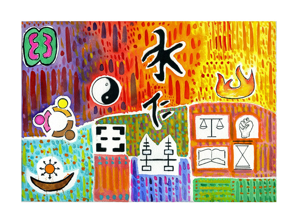
Harmonie en orde: symbolen wereldwijd
Suffanti: “Harmony and order in society: ‘How Do You Say Wisdom and Harmony?’ A Guide on How to Live Your Life reflects symbols like the Four Cardinal Virtues, Amor Fati, Confucius and Adinkra… All about working together and creating productive and harmonious societies.”
Aquarel Greg Suffanti
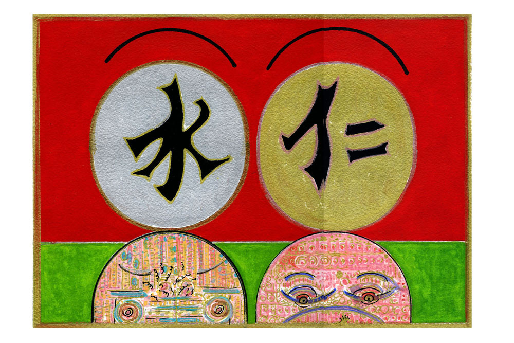
Confucius’ werelddroom
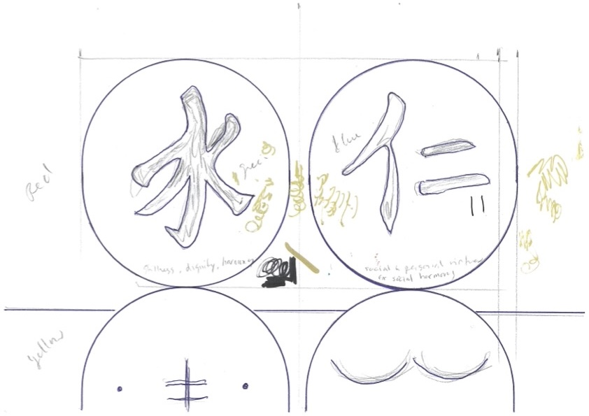
Suffanti: “Confucius and Amor Mundi is exactly what the title suggests. The Chinese symbol on the left is related to Confucianism and represents stillness, dignity and (inner) harmony. While the symbol on the right relates to social and personal virtues for social harmony. In all of the paintings in this series I’m trying to link other traditions to Amor Mundi, community and togetherness in the world, our giant metropolis. The red is easily relatable to China, and the spring green suggests rebirth and auspicious, fruitful conditions. I have used the two symbolic egg shapes as the heads of a man (left) and a woman on the right. Their torsos are filled with colors, shapes and movement to show the complexity and nonstop challenges of life. The woman is pregnant, and you can see a tiny hand reaching up into view. Life is always changing, and the choice of a pregnant woman is to represent the cycle of life. They are both crowned with a half halo suggesting the sanctity and preciousness of life.”
Aquarel Greg Suffanti
Kairos en Kronos
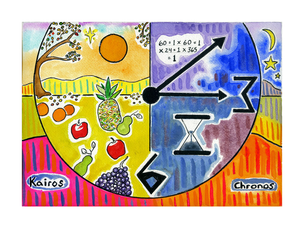
Suffanti: “With Kairos and Chronos I wanted to show that they inhabit the same world, just in different ways. My ‘math formula’ reads: 60 seconds equals 1 minute, times 60 minutes equals 1 hour, times 24 equals 1 day, time 365 days equals 1 year. An hourglass also marks the time, along with the clock/world. With Kairos, it’s harvest time. The time is right. There’s a star next to the sun, alluding to the religious side… I read Kairos is considered ‘God’s voice’.”
Aquarel Greg Suffanti
Transformatie van de geest
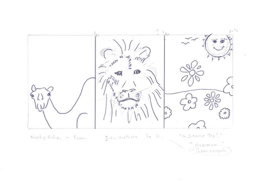
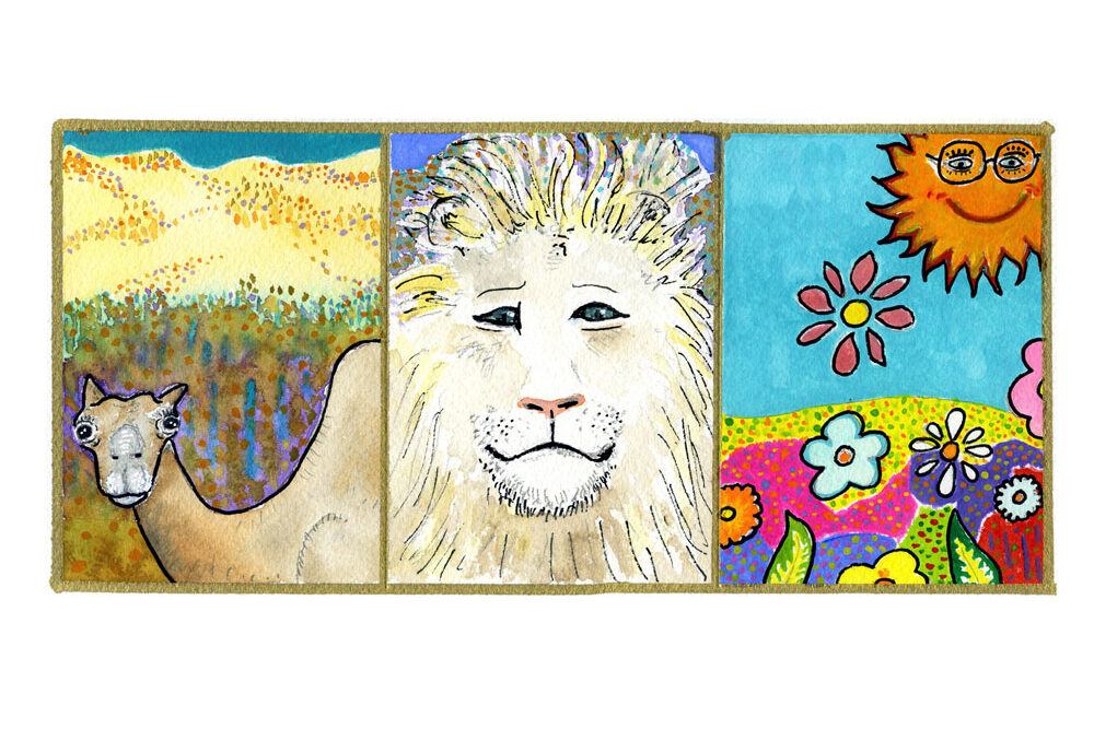
Suffanti: “Nietzsche’s illustration of the development of the self is explained in his story of the camel, the lion and the child. In my aquarelle Nietzsche – From Individuation to the Ubermensch I retold this story with my choice of composition, depiction of character, color and the feelings they illicit. The idea that the self is limited when only collecting and carrying heavy loads, including acquisition of knowledge, like a camel in the desert, is shown in the composition, with the camel at the bottom of the composition, surrounded by desert sands, and just a sliver of blue sky at the top. The sky represents true freedom. I chose to give the camel a hapless look, a combination of fear and ignorance. Ultimately, the camel is due to fail, a slave to his burdens. The lion is crammed into the composition, again, just a sliver of blue sky above him hints at true freedom. The lion fights against the dragons: religion, government and other authority figures/institutions. The lion looks directly out to the viewer, asking for the viewer to look inward and see their own struggles to find genuine freedom and happiness. It’s the lack of freedom and true happiness that results from all the pointless travails of life. Nietzsche concludes that true freedom and happiness come from developing the free mind of a child. He called this mind a ‘self spinning wheel’. A giant smiling sun sits in a beautiful clear blue sky. The composition of rolling hills and brightly colored flowers signifies the innocence and beauty of childhood. The joyful and free composition as well as the choice of colors are similarly intended to invoke a feeling of joy and freedom.”
Aquarel Greg Suffanti
Krachtens het absurde
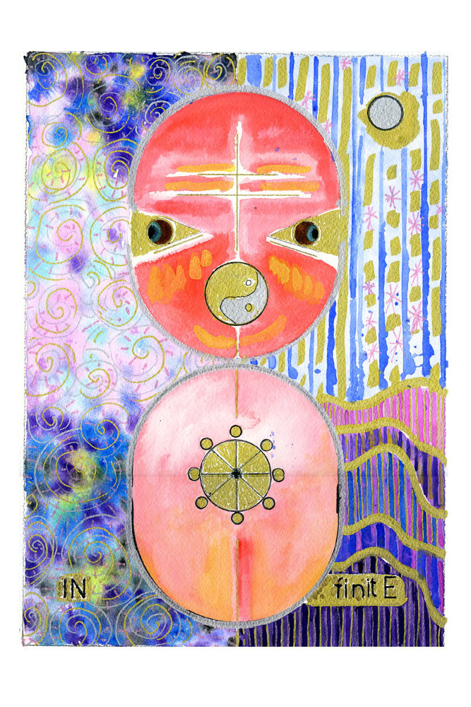
Suffanti: “Kierkegaard’s Primordial Existential Polarities shows a human, composed of two egg-shaped halves. I was inspired by Ilario Colli’s article, The Finite and the Infinite in Kierkegaard. In fact, I broke the word Infinite into two halves to show Kierkegaard’s idea of life being a process of self becoming, of working with both earthly and heavenly influences…. The finite and the infinite. Colli writes that for Kierkegaard, “the self is, both innate and acquired, both bound by necessity and also freed by possibility.” I’ve tried to show these two worlds, the heavenly on the left, the worldly on the right. Note that the color palate is quite similar. I wasn’t trying to show the two worlds as being radically different from one another…. But, rather, their similarities… And our need to reconcile them in order to be fully happy and developed. As individuals, we all are trying to grow and balance our lives in a constantly changing world. We also are also constantly changing. Note also the two eyes looking out to two different possibilities, again, a reference to this balancing and a nod to Janus, looking both ahead and back to the past. For the mouth I’ve used a yin-yang symbol and for the heart, a Buddhist wheel, both referencing other traditions that seek to balance what Colli calls “the finite and the infinite represent(ing) two primordial existential polarities.””
Aquarel Greg Suffanti
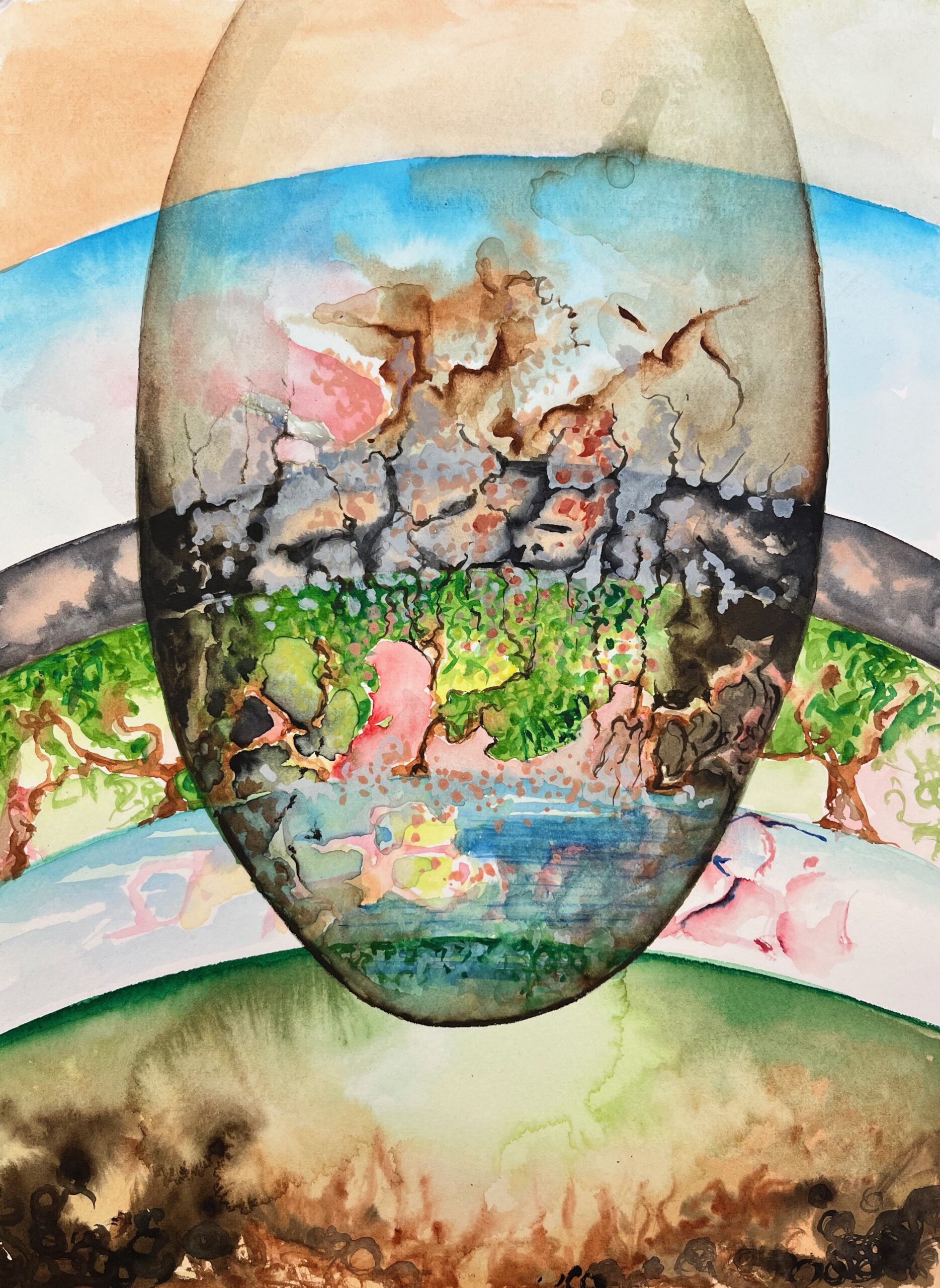
Jungs kosmische ei
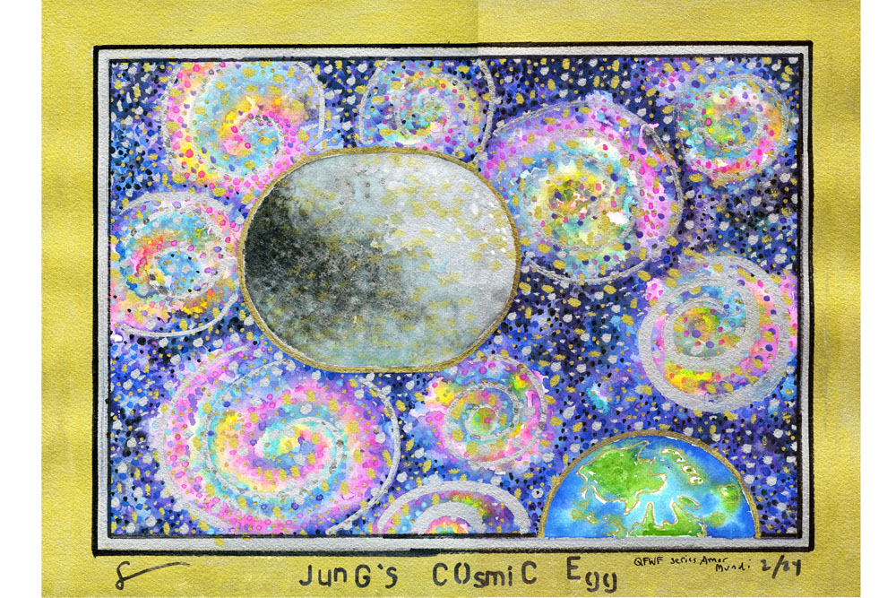
Suffanti: “In Jung’s Cosmic Egg I tried to symbolize the human condition, represented by the egg, connected to the heavens/cosmos, which literally surround the egg, the earth floating in the lower left corner. Jung said that “Out of the egg… will rise the eagle or Phoenix, the liberated soul, which is ultimately identical with Anthropos who was imprisoned in the embrace of Physis.” (or the process of unfolding… like a flower) Jung, Psychology and Alchemy: Page 202. Jung also said “I am the egg that surrounds and nurtures the seed of the God in me.” Jung, The Red Book: Page 284. I tried to visually connect these ideas by using the entire surface, including a gold border to link the entire composition as one entity… The idea that God, the heavens and the elements are just one cosmic whole. The dark and light areas of the egg refer to the need to reconcile male /female energies, and dark/light – conscious /unconscious elements of our one being. As Jung states: “One does not become enlightened by imagining figures of light, but by making the darkness conscious.” The Collected Works of Carl Jung, Vol. 13, Page 335. I tried to also reinforce this notion by placing the egg alone in the cosmos, far from earth… Symbolizing our own unique cosmic journey in life, coming and leaving our earthly existence utterly alone. I wanted the universe to feel alive with color and movement and stars, reflecting the constant movement of everything seen and unseen. The prolific use of silver and gold represents the sanctity of life as well as the interconnectedness of all of life.”
Aquarel Greg Suffanti
Bubers ik en jij
Suffanti: “Buber’s ‘I and Thou’ – And the Results of Subject/Object Designation explores his idea of how people /societies approach life in terms of dividing into either I/Thou or I/It relationships. What I found interesting is Buber’s idea that in subject /object based relationships there is an element of respect. Buber asserts that in doing a good deed, the space between the two, the doer and the recipient, is God. It is for this reason that the composition is framed by the heavens. The words I, Thou and Subject all appear in one sunny, flower filled space. This symbolizes their connectedness and the choice of bright colors and tulips shows this to be a life-giving, healthy relationship. There is a conversation bubble just to the right with a red heart. According to Buber, it is through respectful and caring dialogue that we achieve this result. By contrast, the words I, It and Object are broken into two separate boxes. In this type of designation there is an absence of respect, reducing people /groups /societies into mere objects. Further, the words themselves are separated from each other, reinforcing the lack of harmony through togetherness. The letters O, B and J are surrounded by many dots of browns, black and silver, symbolizing slaves/slavery. Chains lead down into the next box containing three slaves. The border of the Confederate flag and a swastika show the results of I/It designations. However, there is a pink border and the swastika sits in a triangle, symbol of gay rights. And the green border suggests the possibility life. Note also the green background used for the word It. You can regard someone as as It, however, this doesn’t change the fact that he/she is a human being. This symbolizes the life force that always exists… That will ultimately always survive and flourish. The = sign and blue background is the international symbol for Equality.”
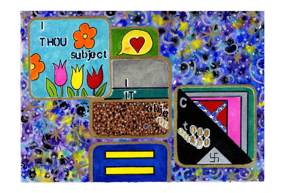
Aquarel Greg Suffanti
Heideggers anonieme zelf
Suffanti: “I was thinking of the German director Fritz Lang’s film Metropolis that gave me the idea for the first aquarelle, Heidegger’s Anonymous Self I. Heidegger posits that the self is anonymous in the city, lacking an authentic self. The anonymous beings shown in the aquarelle are faceless souls riding past in the metro at the very bottom of the composition. They are inconsequential. Soaring above the metro is a make believe city, a combination of New York and Amsterdam. The city is alive with lights and the heavens above are similarly imbued with color and movement. The idea is that nothing stands still. All of these elements are the ingredients for the development of the authentic self.”
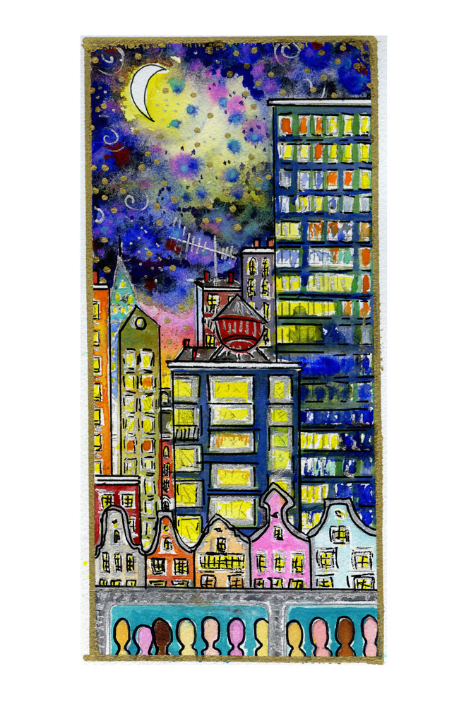
Aquarel Greg Suffanti
Heideggers authentieke zelf
Suffanti: “Heidegger’s Authentic Self II shows the self engaged and connected to their authentic self, which Heidegger explains as the actual development of the relationship that specific person has to their own world. I chose to represent this concept with lines emerging from the foreheads of the people, who form a circle around grey/green ball, symbolizing a rather bland world. Here, the lines go out of the composition, connecting to essentially nothing… To space and the cosmos. This deliberate choice represents the individual connecting to their own consciousness… To ideas. No matter what physical object may inspire, they are just like philosophy or ideas that also motivate in the sense that they are non-physical… They all come from the mind.”
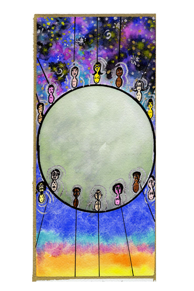
Aquarel Greg Suffanti
Arendts amor mundi
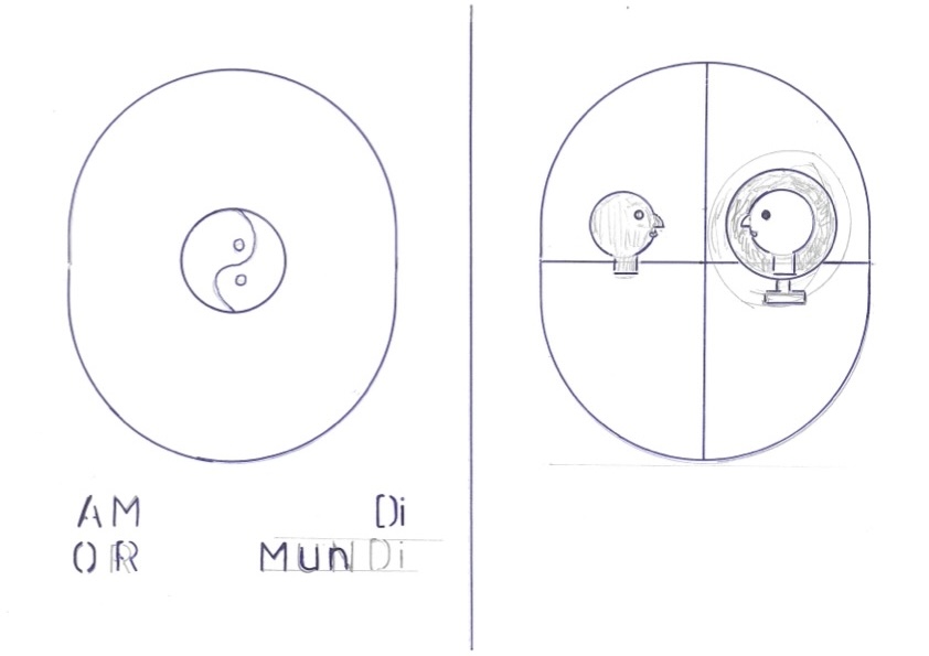
Suffanti: “I kept the egg-form in Hannah Arendt’s Amor Mundi. Here, the two eggs represent two worlds. On the left is Arendt’s fully realized Amor Mundi. The background colors are warm and vibrant, lovingly supporting the world. In the center is a silver and gold yin-yang symbol, indicating harmony…The harmony that is achieved through self-love, which leads to the possibilty/state of Amor Mundi, or love of the world. According to Arendt, one must reflect inward… Encounter one’s own demons. This self-reflection I show in the other egg, with a man looking into a mirror at himself. This world is a bit more divided, and the use of gold and silver dots represents all of the components of life, past and present, which form who we are and how we relate to the world. Further, Arendt challenges us to accept the world as it is, warts and all, and just like we’ve learned to love ourself, we learn to love the world… Without trying to change it. The change is wholly internal!”
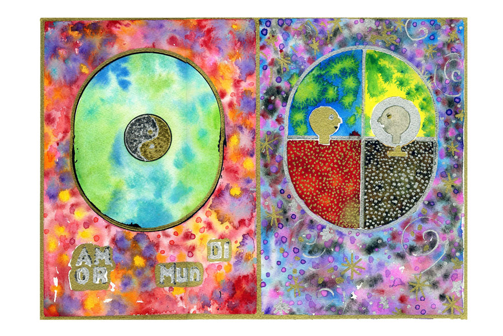
Aquarel Greg Suffanti
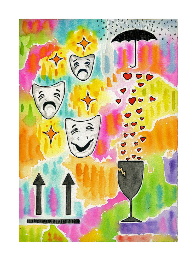
Nussbaum en de breekbaarheid van het goede
Suffanti: “Love, Tragedy and the Fragility of Goodness is rather self-explanatory. I wanted light, playful shapes and colors to reflect a feeling of happiness and love. There are three “handle with care” symbols… I particularly like the umbrella keeping the rain off of the hearts, which are falling into a fragile glass.”
Aquarel Greg Suffanti
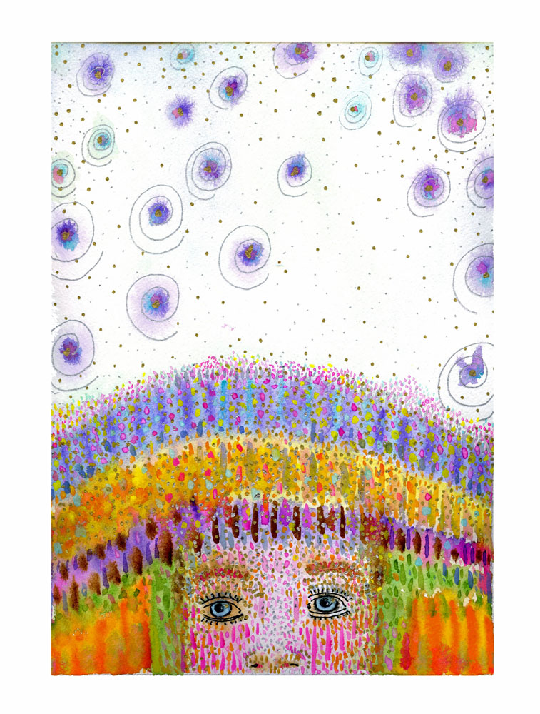
Nomadisch denken
Suffanti: “Spaciosity and Nomadic Thinking is a portrait of Jean-Luc Nancy’s concept of spaciosity in nomadic thinking… It’s all about space and freedom… Even freedom from conceptualization! When we look at our own physical mind we often have the feeling that our mind occupies a space both inside and around our body. This concept I embraced and thus merged the figure, who I purposely left androgynous, with the rest of the space. The sky, heavens… Space itself occupy the majority of the painting, as though thought travels through space/ether… Or is it that the thoughts come from space and ether, and we are simply receptacles? Both? In any case, I numbered this one of two, as I see nomadic thinking as being intrinsically linked to the concept of elemental wisdom and glocalization. You could also view the Spaciosity aquarelle as a continuation of the Elemental Wisdom, connecting thought to the elements.”
Aquarel Greg Suffanti
Het werkproces
Traditioneel gezien is filosoferen een echt ambacht, gebaseerd op zowel de analyserende logos als de verbeeldende mythos. Maar in de loop van de geschiedenis van het denken is dat laatste in het beklaagdenbankje terecht gekomen. Door de klassieke denkbeelden, zoals wereldburgerschap, letterlijk te verbeelden rehabiliteert Greg Suffanti aan deze wortel van het filosoferen. Met zijn schetsen en voorstudies van zijn auqarellenserie geeft Greg Suffanti ons een inkijkje in dit ambacht!
